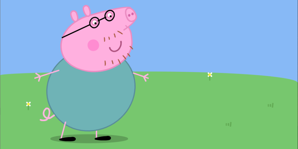
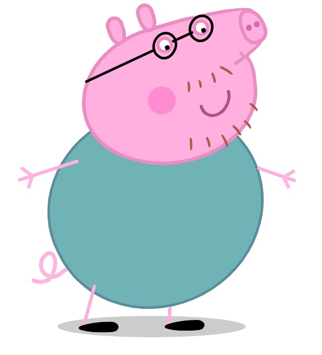
What is a CSS Image?
A CSS image can be made with just simple HTML and CSS code. HTML is a markup language that provides the basic structure and content for web pages, and the CSS is to style the contents. CSS images can be made by creating DIV elements in HTML and style it with CSS, for example setting different color, shape, rotate and size. Combine multiple shapes to to form a complete picture.
It's All Divs and Sections
For this project, all of the div elements that make up the image are nested within a parent div. This parent div is like an invisible frame around the daddy pig's head.
The child div elements positions are based on the relationship to the parent Section with class name "daddy-pig". In other words, all the different pieces of the pig are positioned on the page in relation to that section.
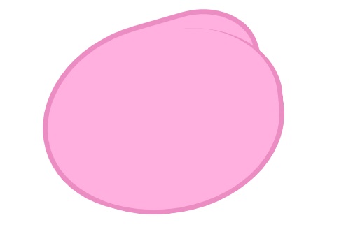
The daddy pig's face div is a child to the box div, and its positioning is based on its relationship to that box. Most of the head parts are designed using border-radius so that we can get oval shapes.
  .daddy-pig {
      padding: 10% 20%;
      position: relative;
    }
border-radius
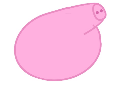
After perfecting the head's border-radius, position the rest of the facial features as child elements of the head, such as the eyes, cheeks, nose and ears. Like the head, the border-radius trick will come in handy since border-radius: 50% may not look appealing. Therefore, we need to adjust and use different border-radius for each side of the shape.
  .face {
    border-bottom-left-radius: 65%;
    border-bottom-right-radius: 58%;
    border-top-left-radius: 68%;
    border-top-right-radius: 37%;
    position: absolute;
      ...
    }
transform: rotate()
Using this property help to position the shape correctly. Most of the body features need to be rotated in order to fit in the right position. For instance, the nose contains more than one div, each div has different shape, size and position. Rotate each div so that we get the completed nose shape.
.nose-top { ... height: 110px; width: 44px; transform: rotate(92deg); ... }.nose-bottom { ... height: 105px; width: 68px; transform: rotate(77deg); ... }
::after and ::before pseudo-elements
Making use of the ::before and ::after pseudo-elements to add content inside a div without needing new HTML elements. For example, when designing the eyes, we need to create the glass frame and also the black cirle for each eye. So the white circle is the main div ".eyes", ::before is for the glass frame and the after is the black pupil of the eye.
.eyes::before { background: transparent; border: 5px solid #000; border-radius: 92% 100% 84% 100%; content: ''; left: -14px; height: 44px; position: absolute; top: -16px; transform: rotate(50deg); ... }.eyes:after { background: #000; border-radius: 100%; bottom: -1px; content: ''; left: -14px; height: 9px; position: absolute; right: 2px; width: 9px; }
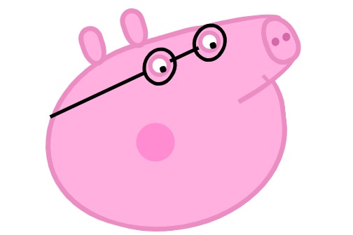
Same method been used to draw other sections of the body. Please feel free to check the complete source code on my GitHub.


Leave A Comment